15 Interior Decorating Essentials

If you’re not a designer or you’re new to the built arts, there’s a lot to know about making beautiful interior spaces. Here, we delve into 15 essential interior decorating tips that you should take into account when trying to create those amazing spaces in your projects.
- Function – Before you being, you need to know how you intend on using the space you want to decorate. Once you know that, you can narrow in on the feel you want the space to have and the kind of furniture, fixtures, art, etc. you’d like to put into the space.
- Feel – You might start on a website like houzz or pinterest to get some design inspiration, but you really want to personalize your designs as much as possible. What I like to do for my designs to pick verbs or adjectives that I assign to each room. Doing this helps narrow my focus on design but leaves things open enough so that I can expand later with things I didn’t originally think of. Some examples: soft, light, refreshing, feminine.
- Plan – When starting any legitimate architectural design project, you’re going to need to come up with a plan. Take some measurements of your room and make a quick sketch showing your room. If you have take a lot of measurements or just want to make the process easier, I highly recommend investing in a laser distance measure. Take care to note the location of windows, outlets, air ducts, and any existing communications outlets.
If you’re not incredibly savvy drawing, you might consider using AutoDESK’s free online homestyler to create your plan. If you plan on doing a lot of decorating you might want to try using sketchup to create your plan. Here at designer hacks we have a ton of free sketchup tutorials for you if that’s something you want to pursue.

- Choosing your color palette – An huge essential of a well designed room is making sure all the colors work together. If you’ve never been good at art or aren’t visually inclined, that can be a huge headache. I recommend using Adobe’s Kuler. There’s an explore tab that will help you pick predefined palettes. Design seeds is a great place to go too. Over there you’ll find a little softer color palettes that are inspired from photographs.
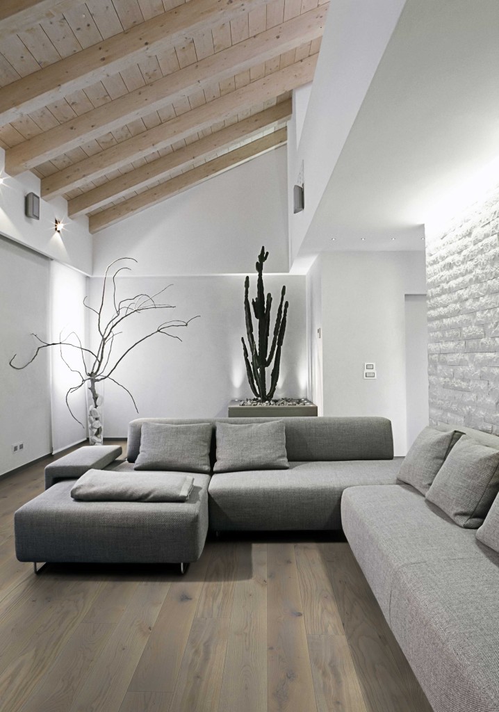
- Designing a contemporary home -If you’re looking to achieve a contemporary look there are a few guidelines you should follow. The most prominent feature of a contemporary design is emphasis on clean lines and shapes. This is the less is more mentality. Make sure whatever kind of stuff you put into your space has a purpose.
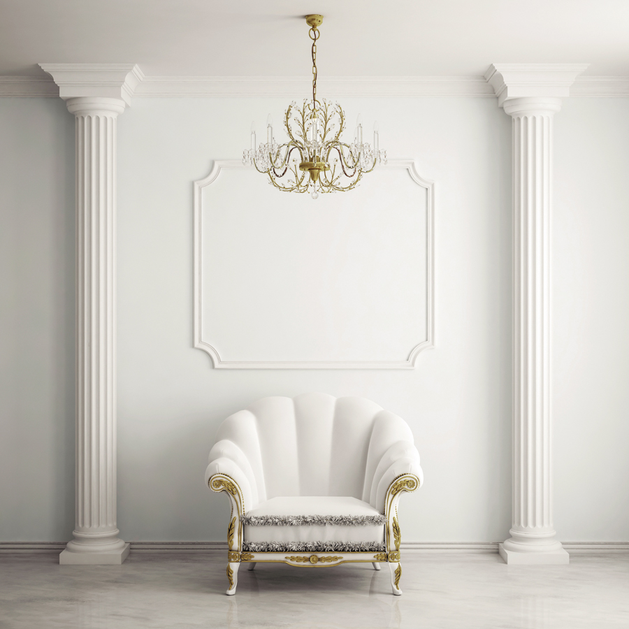
- Designing a traditional home – Traditional homes are a bit tricky because ‘traditional’ had such a wide connotation. For this, I’m going to define traditional as a formal colonial style home. If that’s the case, one interior thing to do is to make sure you have beautiful and decorative base and ceiling trim. Any columns or pilasters you have should look fancy and have a nice capital and base as well. The decorative column doesn’t have to be structural, just wrap your columns in something nice. For your floors, wood is always a safe design bet.
- Hanging pictures – I’m not going to bother to tackle this one. decorateITonline has covered this one and knocked it out of the park.
- Poster height – Posters are actually supposed to be hung the same way as pictures. What’s that mean? All art is hung the same! I love Ab Chao’s post on the topic. She came up with an awesome mnemonic device to remember, “sixty to center”. That means, no matter your art, the center of it should be around 60″ above the floor. For anyone using the metric system… maybe you can come up with a mnemonic device for 150cm and leave it in the comments below.
- TV height and view distance – Nextday tech has a great spreadsheet for figuring out your ideal tv mounting height and viewing distance.
- Furniture spacing – The basics of furniture spacing is a great article on apartment therapy that covers this topic. When I’m designing, I usually use 18″ spacing between furniture you’re willing to scoot around and 36″ for anything with major circulation.
- Focal point – Don’t be afraid to add a focal point to your designs. Think of designing a room like painting on canvas. Your eye is going to move around the room in a particular way because we naturally give order to things, and we can only process one thing at a time. If you want a room to have a particular focus, don’t be afraid to have an accent wall or contrasting piece of furniture. A focal point can scream, “Hey, look at these pictures!” or… “Hey, come relax!
- Kitchen space – In order to ensure that you have enough room to maneuver in your kitchen you should have 3′-6″ (42″) clear between cabinets. Counter heights are typically around 36″ high and bar counters are around 42″ high.
- Making a small room feel bigger – It’s common to have a small room that you have big plans for. I’m in full support of making the most of your square footage. In order to do that, you’re going to want to use lighter colors. Darker colors feel comfy, but trigger our primal instincts and make us travel back to the days of cave dwelling. Maximize light, and any views out of windows to avoid this. Use lines that draw your eyes around the space so that you can give the illusion of a wider or taller room. Verticals will make the room feel taller, while horizontals will make it feel wider. Make the most of any furniture you put in there. You might want to consider a beautiful couch that has a folding seat where you can store books inside of.
- Shelve height, spacing, & reach – If you’re putting up shelves a good height to put your bottom shelf is at 52″ above the floor. This will allow you to still comfortably put a desk under the shelves, and whatever you place on the shelves will be within reach. According to about home, for multiple shelves your spacing is going to be dependent on what you place on the shelves. Your above counter shelving should be within a 1′-0″ reach of any counter’s edge.
- Lighting – You may have picked an awesome color scheme for your room but if you can’t see in it, you’ve wasted your time & money. Be aware that when you’re choosing colors for your room, they’re going to look darker or lighter depending on the lighting level. That deep purple or red can end up looking black. Make sure to position lights on focal points and surfaces that will look dark in low lighting. That will ensure that during a storm or at night, your room still embodies the character you designed into it.
If you’re looking to delve deeper, this book is a great guide for interior designers or anyone looking to really understand how to design interior spaces.
If you have any additional interior design tips you’d like to add, or have questions, leave a comment below!

Trackbacks/Pingbacks
[…] everybody, but, for some, it can be a super fun leisure activity. Before you embark on your next interior design project, read these fantastic summertime tips to help you […]