What is a portfolio and how to you can get an awesome one

What is a portfolio?
There are two major types of portfolios: financial & work.
A financial portfolio refers to a collection of financial assets or investments. Any combination of mutual funds, stocks, bonds, hedge funds, cash etc. is considered a financial portfolio.
I won’t delve too deeply into this type simply because I’m not a financial expert. However, I will say that having an array of financial assets is crucial in the 21st century. Don’t put all your eggs in one basket. To learn more head to this helpful post outlining 10 steps on building a complete financial portfolio.
What I instead will focus on is the second type.
A work portfolio is a catalog of your best work. Often times, it will accompany a resume or CV (curriculum vitae) and is presented during an interview. It is intended to show how you cultivate the experience on your resume into tangible results. While this type of portfolio is certainly applicable to any industry or field (and can give a competitive edge in the hiring process), it is most commonly used in design professions where the result of work is mostly visual.
As an architecture graduate, I quickly learned how to construct a work portfolio that impresses. So now we’ve answered the question”What is a portfolio?”, lets delve into how to create an awesome one.
How to create an awesome job portfolio
Collecting all of your work to be presented during an interview can be a daunting task, but the good news is you have a ton of options. The bad news is that because you have so many options, there’s really no reason not to have a portfolio.
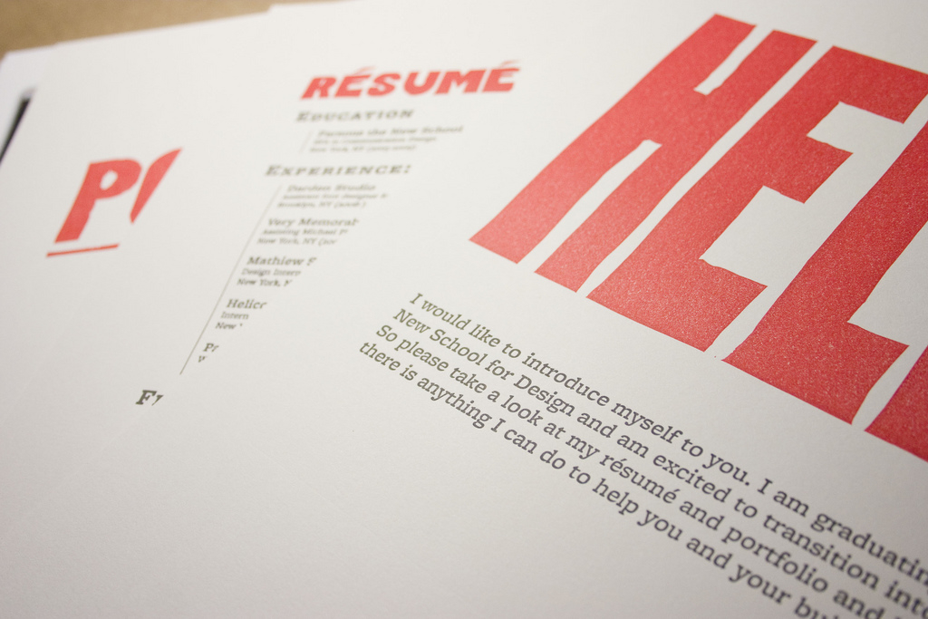
The traditional physical portfolio – The most traditional way to assemble a work portfolio is to format all of your work onto 8.5×11 paper (Letter size). To do this I’d recommend using Adobe Indesign or Adobe Photoshop, or for those with no budget, Gimp or Inkscape. Get some quality paper to print on. I recommend buying some quality matte photo paper to print on. Get some clear sheet protectors to place your prints into and clip them into a professional looking binder.

Photo courtesy of Scott Kellum under the creative commons.
Pros: Creating your portfolio this way is probably the easiest from a logistic and longevity point of view. It’s easy to make new sheets as you expand your body of work or redo pages that just don’t have the flare you’re looking for.
Cons: Because this kind of portfolio is so easy to make, it’s also the easiest to replicate. Showing up to an interview with one of these may not give that wow factor you’re looking for.
The pro printed portfolio – It’s never been easier to make self-published books. There are companies you can send PDFs to and have them print and bind your file into a professional looking book. For my architecture thesis and capstone studio, I had books printed through lulu.com. I highly recommend them, I’ve never had any issues. Just be aware, if you want to go this route, download their template pages before getting started. That way you can make sure everything is formatted correctly and ready to print on-demand. Also note, there aren’t unlimited options for the size you can print at.
Pros: You get a nice, sturdy high-quality portfolio that is sure to get that ‘wow’ factor.
Cons: It’s not easy to add or remove projects. Every time you want to do that, you’ll need to reprint everything.
The ‘out of box’ portfolio – I heard a story about a girl who really wanted to work at a particular architecture firm in Europe. She built a beautiful wood case for her portfolio that she then shipped over seas. She was essentially banking on getting this one job. The result? She got the job because her portfolio stood out and she went the extra mile to show her determination. Obviously, this may not work for everyone, but making a point to stand out is a good one.
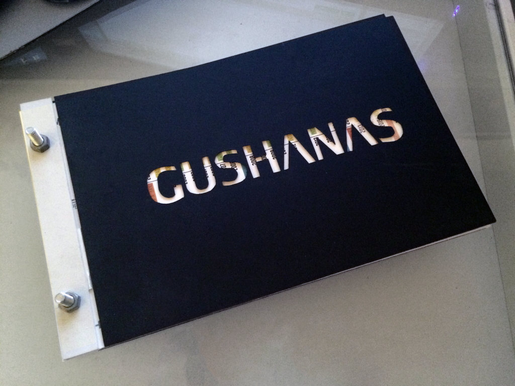
When I was feverishly applying to different architecture jobs I constructed my own version of an ‘out of box’ portfolio. It was essentially a merge of the aforementioned traditional portfolio and the pro printed portfolio.

It gave me a unique flair but also remained fairly easily adjustable.
How I made my portfolio
To make a sturdy impressive cover I purchased some polystyrene and xactoed my last name out of it. To mask some of smudges that had occurred over time, I spray painted the polystrene black. It paints really well.
The binding was just a nut and bolt I shoved through a strip of polystyrene that I hole-punched.
Connecting the cover with the binding is a strip of mylar.
All of the pages inside were professionally printed at kinkos.
Pros: An out-of-the box idea for your portfolio may help an employer remember who you are. Because there are no restrictions, you can made it as adjustable as you want.
Cons: It’s going to take some time to design something that works for you and represents your style. If your under a time crunch, this could be stressful.
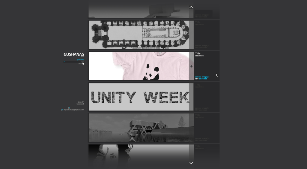
The online portfolio – By far, my favorite type of portfolio is the online one. It gives you the most flexibility and the biggest bang for your buck. You can literally add all of your work on it and not have to worry about trimming things down. It lets whoever goes to your site decide what they want to see!
By tracking where visitors to your site go (through something like google analytics) you can get a feel for what portion of your work people are most drawn to. That will help you decide what work should be in your physical portfolio (which you should still have). As an added bonus on sending potential employers through your portfolio, you can track to see if they’ve taken the time to open your website through the link you sent them.
Not to mention, showing an employer you’re savvy enough to have your own website goes a long way. And a secret? Setting up a website has never been easier. I have a step-by-step process that shows how to set-up a portfolio website in less than five minutes.

Still not convinced? A website is a great place to store or backup files. It was really simple at my last job to dump work onto my website and work from home the next day, or just make sure I had documentation of things I wanted to add to my portfolio. To upload an image file to your site, it’s as simple as dragging and dropping. Seriously.
The Review
Now that you’ve answered the question, “What is a portfolio?”, and you’ve been given the resources to create an awesome one, it’s time for the review. This is an important step because you need to see how other people interpret your work and if your presentation is successful at getting the reaction you hope for.
For your review, you’ll need to give your portfolio to another person to critique. That means you let them give you some pointers on areas you might be able to improve it. Oviously, take their critique with a grain of salt. You don’t need to incorporate all (or any) of their suggestions if you don’t want to. This was a hard one for me to overcome for a long time because I’m a ‘people pleaser’. At the end of the day you need to be able to stand by your work and be proud of it.
Feel free to send any of your portfolios to me to review at [email protected]. I’ll get back ASAP.

No comments yet.