
Avoid These 3 Graphic Design Mistakes Like the Plague

Hey designers! If you watch our channel or read some of our other tutorials, you know that we like to teach you the best tips on Sketchup, architecture, and design. In this article, however, we’re going to go over three mistakes you DON’T want to make. Specifically, graphic design mistakes. No matter what kind of designer you are, you want to be sure that you’re putting your best work out there. Some of these tips can be applied to any kind of design, so even if you’re not a graphic designer, check it out!
The tips we’re going to cover deal with the client and what you should be focusing on when creating a presentation or final document for them.
3 Graphic Design Mistakes
1. Check Your Copy
In this example, the designer used a template to create the image. The template had a few fonts included: one for “Q & A,” one for the cursive text, and two for the main title. These all look fine, but if you look closer you will realize it is not grammatically correct, and it also doesn’t match the title the designer was given. This image has a very small amount of text, so for something like this, it is even more important the text is grammatically correct and identical to the text you were given.
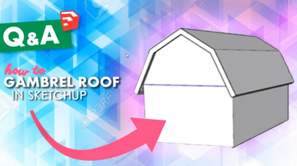
In the case that you do get a copy that is grammatically incorrect, it is best to compile a list of everything that is incorrect and ask the client if it was purposeful, or if they want you to change it. Be nice! Send it all at once to make it easier for you and the client!
2. Avoid Pixelated Images
This may be one of the most important mistakes to avoid when doing graphic design! It’s your job to create crisp and aesthetic images, so never ever use a pixelated image. Even if the rest of your document is spot on, a pixelated image will really bring the quality down. See this fuzzy picture is no fun to look at right?
If you do come across an image that isn’t sharp and was provided by the client, just contact the client to see if they can provide a higher quality image or any alternative images.
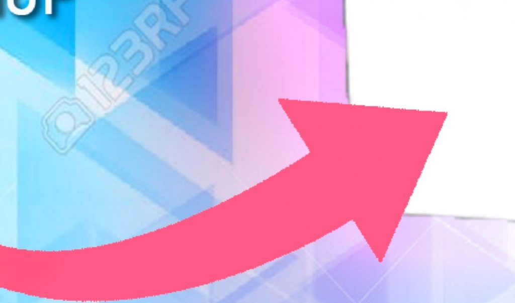
3. Stop Being Lazy
The last of the graphic design mistakes to avoid is being lazy! Being lazy can lead to poor quality or even legal repercussions! In this example, the designer pulled an arrow off a website to use in the document. This could result in copyright infringement if they were not given permission to use the arrow. Also, if you look closely, you can see how jagged the edges of the arrow are. This could be because the designer just erased the background color and didn’t bother sharpening the edges. A simple fix would have been to just use the pen tool to trace around the shape to create clean, crisp lines.
If you’re looking for high-quality images to use in your next design, there are plenty of sites that offer free, high-res stock photos. Take a look at 123rf, pexels, and unsplash. The next time you go to design something for a client, be sure to keep these graphic design mistakes in mind so that you can create quality work that you and your client will both be happy with.
Happy Hacking!
No comments yet.